June 11, 2025
New Dashboard Sheds Light on the Sponsored Program Lifecycle
The sponsored program lifecycle at the UW spans multiple systems and teams—including SAGE, Workday, the Office of Research, and Finance Planning & Budgeting. Historically, there was no way to view processing data from award setup through closeout, making it difficult to identify delays, monitor workloads, or plan proactively. In the absence of comprehensive data, teams often had to rely on limited observations, opinions, or the most visible parts of the process—leading to reactive planning, misaligned priorities, and missed opportunities for improvement.
The new Sponsored Programs Setup Metrics Dashboard helps close this gap by providing data to support better decision-making, anticipate processing times, allocate resources effectively, and strengthen cross-team collaboration. It also gives campus users visibility into where their specific awards are in the process.
Collaborating to Meet Requirements
This dashboard was developed through the Awards Improvement and Development Effort (AIDE), an initiative between Finance Planning & Budgeting, the Office of Research, and UW-IT, which aims to transform grant management at the UW. The dashboard directly supports AIDE’s goals, by promoting transparency, coordination, and efficiency across the sponsored program lifecycle.
About the Dashboard
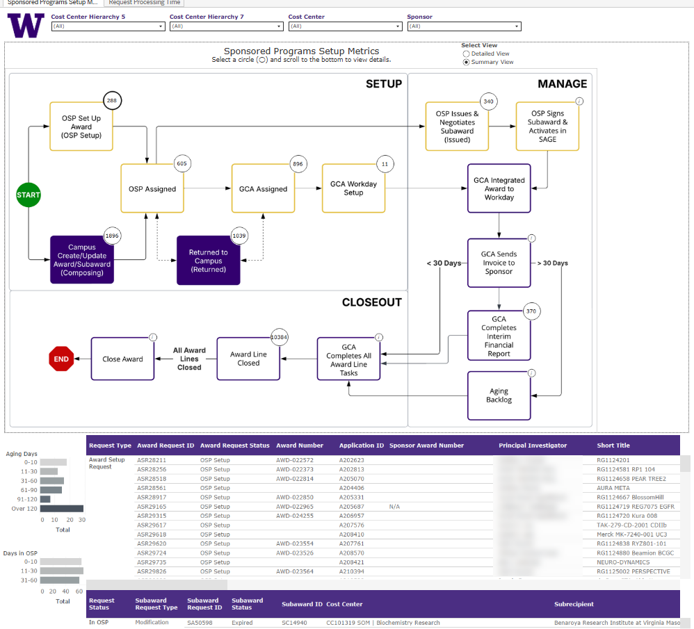
The Sponsored Programs Setup Metrics Dashboard displays in-progress items at each stage of the lifecycle, in two different views:
Sponsored Programs Setup Metrics
This view displays sponsored program lifecycle data in a flowchart, combining active award and subaward requests from SAGE with active work items and tasks from Workday. In this view, users can:
- Toggle between summarized and detailed flowcharts.
- Use filters to refine results.
- View previous-year trends for select steps.
- Display additional detail for select steps.
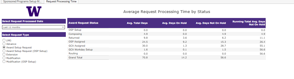
Request Processing Time
This view shows the average time a request spent in each status for recently processed SAGE requests. Hover over a value to see a monthly breakdown graph. Use filters to adjust the date range and request type.
Questions?
Email DATAGroup at datagrp@uw.edu and include “Sponsored Programs Setup Metrics” in the subject line.