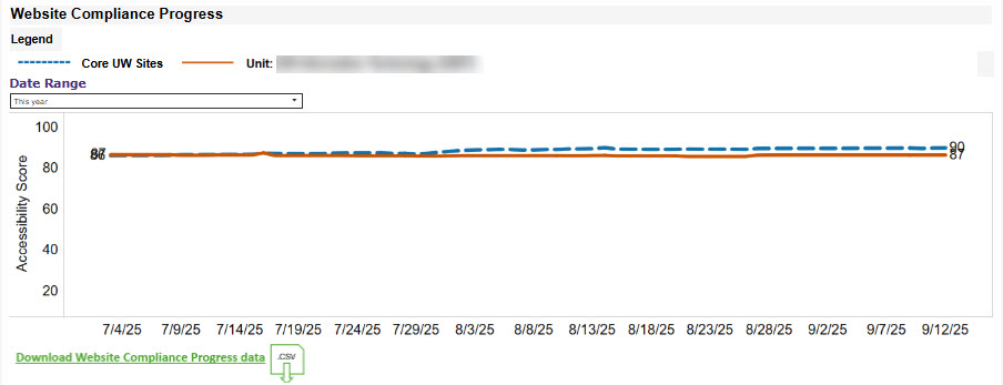
Skip to content

New Dashboard Sheds Light on the Sponsored Program Lifecycle

The sponsored program lifecycle at the UW spans multiple systems and teams—including SAGE, Workday, the Office of Research, and Finance Planning & Budgeting. Historically, there was no way to view processing data from award setup through closeout, making it difficult to identify delays, monitor workloads, or plan proactively. In the absence of comprehensive data, teams often had to rely on limited observations, opinions, or the most visible parts of the process—leading to reactive planning, misaligned priorities, and missed opportunities for improvement.

The new Sponsored Programs Setup Metrics Dashboard helps close this gap by providing data to support better decision-making, anticipate processing times, allocate resources effectively, and strengthen cross-team collaboration. It also gives campus users visibility into where their specific awards are in the process.

Collaborating to Meet Requirements

This dashboard was developed through the Awards Improvement and Development Effort (AIDE), an initiative between Finance Planning & Budgeting, the Office of Research, and UW-IT, which aims to transform grant management at the UW. The dashboard directly supports AIDE’s goals, by promoting transparency, coordination, and efficiency across the sponsored program lifecycle.

About the Dashboard

The Sponsored Programs Setup Metrics Dashboard displays in-progress items at each stage of the lifecycle, in two different views:

Sponsored Programs Setup Metrics

This view displays sponsored program lifecycle data in a flowchart, combining active award and subaward requests from SAGE with active work items and tasks from Workday. In this view, users can:

  • Toggle between summarized and detailed flowcharts.
  • Use filters to refine results.
  • View previous-year trends for select steps.
  • Display additional detail for select steps.

A screenshot of the Sponsored Programs Setup Metrics view of the dashboard.

Request Processing Time

This view shows the average time a request spent in each status for recently processed SAGE requests. Hover over a value to see a monthly breakdown graph. Use filters to adjust the date range and request type.

A screenshot of the Request Processing Time view of the dashboard.

Questions?

Email DATAGroup at datagrp@uw.edu and include “Sponsored Programs Setup Metrics” in the subject line.

Streamlining Registration Tracking with Tableau

Development of the new Period 1 Registration Metrics Tableau workbook started with a question: “can we make this process easier?”

For Ammy Phuwanartnurak, a Service Manager/Business Analyst on UW-IT’s Student & Educational Technology Services (SETS) team, this question surfaced during her quarterly push to gather Period 1 registration metrics. Every Fall, Winter, and Spring quarter*, she compiled registration data on student groups, transactions, and courses, then calculated the year-over-year growth rate for each day in the Period 1 window.

*Note: Summer quarter Period 1 registration is different than other quarters and does not have a high traffic load, so it is excluded from this tool.

This process, while important for her stakeholders, required hours of gathering data and working through spreadsheets. The new Period 1 Registration Metrics workbook automates this task, while providing stakeholders with accurate, timely insights into how students are registering during Period 1 window.

This workbook is hosted on UW-IT’s Tableau server with access managed via a UW Group. Although not widely available, this workbook shows a powerful data solution that emerged from cross-team collaboration.

What is Period 1 Registration?

Period 1 registration is the first window when continuing students can register for classes, with access opening on different dates based on class standing, earned credits, and other considerations. Students receive assigned registration dates and can make schedule changes throughout the period. For more information, refer to Registration Periods.

Collaborating to Meet Requirements

Creating this workbook was a cross-team effort! Ammy Phuwanartnurak from the SETS team provided the requirements and feedback, while Grzegorz (Greg) Grabowski from the Business Intelligence (BI) team developed the workbook and the dashboards within it.

About the Workbook

The Period 1 Registration Metrics workbook displays data in multiple dashboard tabs, each tailored to answer specific questions, which are explored below.

Student Registrations by Student Groups

This dashboard answers the following questions:

  • Which student groups participated in Period 1 registration?
  • How many students registered during the current quarter’s Period 1 window and how does this compare to the same period last year?
  • What’s the daily and cumulative registration headcount (both unique and duplicated)?

A screenshot of the Student Registrations by Student Groups dashboard tab.

Transactions by Student Groups

This dashboard answers the following questions:

  • How many successful registration transactions were completed each day during Period 1?
  • What’s the total volume of transactions (successful and unsuccessful)?
  • Are transaction volumes increasing, decreasing, or consistent compared to last year?

A screenshot of the Transactions by Student Groups dashboard tab.

Registered Students by Course

This dashboard answers the following questions:

  • What courses are students registering for during Period 1?
  • How many students are registered in specific courses, on a daily or cumulative basis?
  • What are the most and least popular courses during this registration period?

A screenshot of the Registered Students by Course dashboard tab.

Questions/Feedback/Ideas?

Do you have a question about this workbook and/or a request for a new resource in the BI Portal? Please submit a ticket to help@uw.edu with “BI Portal” in the subject line.

Announcement: New Data Addition to the RAD2 Database in EDW

The RAD2 database is introducing the second set of Research Administration Data views, which are obtained from the Research Integration Platform in the Office of Research Information Services (ORIS), whereby data from the SAGE system and associated datasets are integrated.

  • vAdminAction
  • vAdminActionSubtype
  • vAdvance
  • vAward
  • vAwardRequest
  • vAwardSetupRequest
  • vComplianceQuestion
  • vComplianceResponse

Definitions for the views and columns will be made accessible in the Knowledge Navigator shortly.

The EDW team will incorporate an additional set of views into RAD2 in the near future as soon as the source data has been verified to meet Production quality standards.

Tentative list:

  • vComplianceSubResponse
  • vModification

The announcement of the RAD2 launch in April can be found here:

https://it.uw.edu/service-news/announcement-launch-of-the-new-rad2-database-in-edw/

Questions?

Please contact help@uw.edu with “RAD2” in the subject line.

UWSDBDataStore Reorg on June 7, 2025

UWSDBDataStore Reorg on June 7, 2025 

The student database (SDB) will go through a reorganization on June 7, 2025 which will cause changes in the Enterprise Data Warehouse database, UWSDBDataStore. These changes to the objects will be available in the UWSDBDataStore on June , 2025
However, data on the new objects will be available as soon as the Data Custodians submit the security role definitions and the SIS team loads the data.

Last Updated – 5.30.2025

Additions

Table Column DataType
SA_TRANSACTION CXLD_CHECK_RPTD bit
SF_EVALUATION CUI_IP_ATI decimal(15,0)
CUI_IP_P_PTA decimal(15,0)
CUI_IP_IPA int
CUI_IP_P_PEEA decimal(15,0)
CUI_IP_AI int
CUI_IP_AAI int
CUI_IP_STX int
CUI_IP_STD_PTA decimal(15,0)
CUI_IP_S_IPA decimal(15,0)
CUI_IP_STD_SEEA decimal(15,0)
CUI_IP_SATI decimal(15,0)
CUI_IP_STAI decimal(15,0)
CUI_IP_SCI decimal(15,0)
CUI_IP_SAAI decimal(15,0)
CUI_IP_SCA int
CUI_IP_STI int
CUI_IP_FTI int
CPS_PJ_DT datetime

Column Renames

Table Column (New) Column (Old)
SA_SF_FUND RPT_STD_WORKTAG FUND_FLAG_46

Data Type Changes

Table Column Data Type (Old) Data Type (New)
SA_DISTRIBUTION DISTR_FAS_REF_CD char(6) char(8)
SA_TRANSACTION OP_DAT_FAS_REF_CD char(6) char(8)
SA_WD_DET_TRANS WD_DET_REF_CD char(6) char(8)
WD_DET_TRANS_INFO char(20) char(30)
SA_WD_SUM_TRAN WD_SUM_REF_CD char(6) char(8)
STUDENT_2_INCOMPLETE_INFO DEPT_ABBREV char(5) char(6)
TRA97_TRANSACTION TRA97_T_AMOUNT decimal(7,2) decimal(8,2)
TRA97_T_PAID_AMT decimal(7,2) decimal(8,2)

Removals

Table Column
 SA_SF_FUND FUND_COST_ACCT_CD
FUND_REV_OBJ_CD
SA_TRANSACTION OP_DAT_CRHR1_BGT
OP_DAT_CRHR1_OBJ
SA_TUITION_PER_CR_HR_CHARGES PERC_REV_OBJ_CD
PERC_COST_ACCT_CD
PERC_BUDGET_NUM
SR_COURSE_TITLES FEE_BUDGET
FEE_REV_OBJ_CD
SYS_TBL_62_TUIT_DISTRIB_SUBTOT DTBL_BUDGET_NUM
DTBL_REV_OBJ_CD
DTBL_COST_ACCT_CD
SYS_TBL_63_NONTUIT_CHARGES ON_CHRG_FAS_TRAN1
ON_CHRG_FAS_TRAN2
ON_CHRG_FAS_TRAN3
ON_CHRG_FAS_TRAN4
ON_PAY_FAS_TRAN1
ON_PAY_FAS_TRAN2
TIME_SCHEDULE FEE_BUDGET
FEE_REV_OBJ_CD


Field moving from SF_Evaluation to SF_Evaluation1:

s_loan_pkg_flg
s_loan_pkg_limit
s_unsub_pkg_flg
s_unsub_pkg_limit
dl_class_code
husky_promise_flg
husky_promise_sum
husky_promise_aut
husky_promise_win
husky_promise_spr
ibc_completed_sw
ibc_completed_dt
ibc_completed_id
inas_recalc_flg
isir_pending
institutional_efc
institutional_sai
inst_sai_blk


Expanding the Grant Manager Dashboard for Grant Financial Analysts

Historically, the Grant Manager Dashboard was only fully functional for users with the Grant Manager role. While users with the Grant Financial Analyst role have always been able to view the dashboard, the Sponsored GrantsAwards, and Sponsored Grants Staffing tabs would appear blank for these users because they weren’t assigned directly to any grants.

Thanks to a recent enhancement, Grant Financial Analysts can now customize the Sponsored Grants, Awards, and Sponsored Grants Staffing tabs with reports designed specifically for their role.

About the Grant Manager Dashboard

The Grant Manager Dashboard provides Grant Managers (and now Grant Financial Analysts!) with a central place to find grant-related content that is specific to them, splitting data across six tabs—Sponsored Grants, Awards, Stand Alone Grants, Gifts, Sponsored Grant Staffing, and Programs.

For more information, including instructions on how to use this tool, refer to the Grant Manager Dashboard job aid.

Note: If working remote, you must connect to the VPN to access these links. For more information, refer to Husky OnNet.

Configuring the Dashboard for a Grant Financial Analyst

Grant Financial Analysts can now swap out the default reports on the Sponsored Grants, Awards, and Sponsored Grant Staffing tabs on the Grant Manager Dashboard with new versions tailored for Grant Financial Analysts.

To do this, the Grant Financial Analyst, must follow these high-level steps

  1. Access Configuration Settings: Open the Grant Manager Dashboard and click the gear icon to access the Configure Worklets window.
    A screenshot of the Grant Manager Dashboard. The gear icon at the top of the screen is highlighted with a red box.
  2. Replace Default Reports: For the Sponsored Grants, Awards, and Sponsored Grant Staffing tabs, add the Grant Financial Analyst-specific reports (R1564.5, R1565.2, and 1566.2), and remove the default Grant Manager reports.
    A screenshot of the Configure Worklets window, which highlights the icons to click to add and remove reports.
  3. Set Report Filters: Edit settings within each tab to apply relevant prompts—such as Company—to tailor the report results to your needs.
    A screenshot of the Edit Worklet Settings window for R1565.2. The report prompt fields and OK button are highlighted with a red box.

For more detailed instructions, refer to the Configuring the Dashboard for a Grant Financial Analyst section of the Grant Manager Dashboard job aid.

Note: If working remote, you must connect to the VPN to access these links. For more information, refer to Husky OnNet.

Questions?

For more information or assistance, please email datagrp@uw.edu with “Grant Manager Dashboard” in the subject line.

Improving Visibility into POs, Programs, and Additional Resources for Grant Managers and PIs

New versions of the Grant Manager and Principal Investigator (PI) dashboards are now available. They help users view their PO encumbrances and liquidations, evaluate their current fiscal year program activities, and connect with relevant resources, by business process area.

This article introduces these enhancements and explains how to access them from the dashboards.

About the Grant Manager and PI Dashboards

Both of these dashboards provide Grant Managers and PIs with a central place to find grant-related content that is specific to them, splitting data across six tabs—Sponsored Grants, Awards, Stand Alone Grants, Gifts, Sponsored Grant Staffing, and Programs.

For more information, including instructions on how to use these tools, refer to the following job aids:

Note: If working remote, you must connect to the VPN to access these links. For more information, refer to Husky OnNet.

About the Enhancements

Additional Resources Tab/Financial Desktop Dashboard

Previous dashboard versions included an “Additional Resources” tab with helpful links for the dashboard’s intended audience (Grant Managers or PIs). To free up space (now used by the new Program tab) and avoid duplication, we’ve moved these links to the Financial Desktop Dashboard, on the Sponsored Grants tab.

The Financial Desktop is a central hub for Workday finance users to discover commonly used reports, tasks, and tools, organized by business process area. For more information, refer to Introducing the Updated Financial Desktop.

Note: You can still easily access these resources from either dashboard. Just click the Financial Desktop – Sponsored Grants link in the Additional Resources banner at the top of the dashboard.

A screenshot of the Additional Resources announcement at the top of the Grant Manager Dashboard. The Financial Desktop - Sponsored Grants link is highlighted with a red box.

Program Tab

The new Program tab lets Grant Managers and PIs select specific Programs to monitor. It summarizes current fiscal year activity for each selected Program and allows users to drill into additional detail if desired.

A screenshot of the Grant Manager Dashboard. The Programs tab is highlighted with a red box.


Purchase Order Encumbrance and Liquidation Summary Report

This new drill-to report is now available in both dashboards and is accessible from the Encumbrance column in the Sponsored Grants and Awards tabs. This report helps users easily view PO encumbrances and liquidations.

To access the report, select the Sponsored Grants or Awards tab, click the down arrow next to a value in the Encumbrance column, and then click the Purchase Order Encumbrance and Liquidation Summary link.

A screenshot of the Sponsored Grants tab. The down arrow next to a value in the Encumbrance column has been selected to display additional options. The Purchase Order Encumbrance and Liquidation Summary link is highlighted with a red box.

This displays a list of POs with summarized encumbered and liquidated amounts, with the option to drill into additional detail if desired.

Note: No configuration is needed to access the new report—it is already embedded in the dashboards for users with the appropriate security role(s).

Set a Dashboard as your Workday Homepage (Optional)

If desired, you can set the Grant Manager or PI Dashboard as your Homepage in Workday. For more information, refer to Setting a Dashboard as your Homepage in the Customizing Workday job aid.

Questions?

For more information or assistance, please email datagrp@uw.edu with “Grant Manager Dashboard” or “PI Dashboard” in the subject line.

Introducing the Updated Financial Desktop

Initially launched during the UW Finance Transformation (UWFT) to help users transition from the legacy MyFD system to Workday, the Financial Desktop primarily served as a crosswalk between MyFD and Workday. Now, with go-live close to two years behind us, it has been updated to better reflect how users work today, serving as a central hub for commonly used reports, tasks, and tools, organized by business process area.

Key Features

Tabs to Organize Resources by Business Process Area

Each tab represents a different Business Process Area—such as Financial Reporting, Sponsored Grants, and Procurement and Supply Chain—and includes curated links to information such as:

  • Workday Tools/Resources
  • External (non-Workday) Tools/Resources
  • Reports
  • Tasks

These links are intended as starting points—not exhaustive lists. They help new users orient themselves and experienced users get where they need to go faster.

A screenshot of the Financial Desktop dashboard. The five tabs are highlighted with a red box.

Quick Tasks Tailored to You

The Quick Tasks section adjusts based on your security roles in Workday, which means that the tasks that display for you may be different than what displays for other users.

A screenshot of the Financial Reports tab of the Financial Desktop dashboard. The Quick Task section is highlighted with a red box.

Static Resource Links

While the Quick Tasks only reflect tasks that you have access to, the rest of the resources on each tab are static and curated to highlight the “heavy hitters”—the most widely used reports and tools. These include links both inside and outside Workday, such as BI Portal reports, knowledge articles, and other external systems.

Note: If a Workday resource does not include a blue hyperlink, that means that you do not have access to that resource.

Set the Financial Desktop as your Workday Homepage (Optional)

If desired, you can set the Financial Desktop as your Homepage in Workday. For more information, refer to Setting a Dashboard as your Homepage in the Customizing Workday job aid.

Note: If working remote, you must connect to the VPN to access these links. For more information, refer to Husky OnNet.

Feedback Welcome!

The current list of links is based on input from the development team—but we know that actual users are the real experts. If you have suggestions for resources to add or remove, please send an email to datagrp@uw.edu.

Introducing the Cost Center Planning & Forecasting Tool

We’re excited to share that a new Cost Center Planning & Forecasting Tool is now available in Workday Drive! This tool allows Cost Center Managers to:

  • View totals by cost center using actual Workday data
  • Enter manual projections for more accurate forecasting
  • Run basic scenario planning—all within a single worksheet

Important Note:

This tool is not intended to replace Adaptive Planning or the formal budget process. Rather, it provides a lightweight and accessible option for Cost Center Managers—particularly those without access to Adaptive—who need to track actuals and plan at the local level.

We encourage you to explore the tool and consider how it may support your operational planning efforts.

Using the Cost Center Planning & Forecasting Tool

You can start using the tool with a few key steps:

  1. Download the template from Workday, pull in live data, and set it up for each cost center you manage.

    A screenshot of the Actuals Data tab of the Cost Center Planning & Forecasting Worksheet. The Live Data pane is displayed, and the Edit Live Data button is highlighted with a red box around it.

  2. Add or update projected personnel (optional). This allows you to plan for additional personnel who are not currently associated with your cost centers. Once added, you can include these personnel in your projections.

    A screenshot of the Projected Personnel tab of the Cost Center Planning& Forecasting Tool.

  3. Enter projected spend values and calculate totals, specifying the employees and/or ledger accounts you want to include.
    A screenshot of a Cost Center tab in the Cost Center Planning & Forecasting Tool. A blank cell is selected under the Operating Revenues section, displaying a list of available options to select from.
  4. Refresh the data as needed to get updated actuals.

    A screenshot of the Actuals Data tab of the Cost Center Planning & Forecasting Tool. The Live Data pane is displayed and the Refresh Now button is highlighted with a red box.
    Note: When you refresh Workday data, the actuals in the Cost Center tabs will update automatically. However, projected values will not get updated. You’ll need to review and update these values manually, as needed.

  5. Share the workbook if desired.

    Note: Security for this tool (both the template and any workbooks created from the template) is managed via security roles. If you create a workbook and share it with someone who doesn’t have the necessary roles, they will be able to view the workbook but not refresh the data—the data will be static.

For more information, including step-by-step instructions, refer to the W0005 – Cost Center Planning & Forecasting Tool job aid.

Note: If working remote, you must connect to the VPN to access this page. For more information, refer to Husky OnNet.

Questions?

Email datagrp@uw.edu with “Cost Center Planning & Forecasting Tool” in the subject line.

Announcement: Launch of the New RAD2 Database in EDW

A new database RAD2 is introducing the initial set of Research Administration Data views, which are obtained from the Research Integration Platform in the Office of Research Information Services (ORIS), whereby data from the SAGE system and associated datasets are integrated.

  • vEGC1
  • vEGC1Abstract
  • vEGC1Person
  • vProposedBudgetData
  • vSubaward
  • vSubawardRequest
  • vSubrecipient

Definitions for the views and columns will be made accessible in the Knowledge Navigator shortly.

The EDW team will incorporate an additional set of views into RAD2 in the near future as soon as the source data has been verified to meet Production quality standards.

Tentative list:

  • vAdminAction
  • vAdminActionSubtype
  • vAdvance
  • vAward
  • vAwardRequest
  • vAwardSetupRequest

Questions?

Please contact help@uw.edu with “RAD2” in the subject line.

Reducing Redundancy: Retiring the “How Many” Reports

To reduce redundancy in the BI Portal catalog, we have retired six academic reports in favor of more robust Tableau dashboard alternatives. These reports were officially retired on March 27, 2025.

The following table outlines the retired reports and their recommended alternatives:

Retired Report Alternative Tableau Dashboard
How Many Degrees by College
How Many Credit Hours by College
How Many Students by Department
How Many Students by College
How Many Students by Campus
How Many Students at the University

Why Use These Dashboards?

  • Comprehensive Data Coverage: Dashboards use census day data, providing a snapshot of student enrollment and credit hours at a fixed point each quarter for consistent comparisons.
  • Flexible Visualization Options: View data in graphical or tabular formats.
  • Customizable Insights: Use filters on the left and breakdowns on the right to explore data.
  • Export to Excel: Click the download icon (top-right) and select “Crosstab” to export.

For more information, refer to How to Use BI Portal Dashboards.

Need Help?

Email help@uw.edu and include “BI Portal” in the subject line.